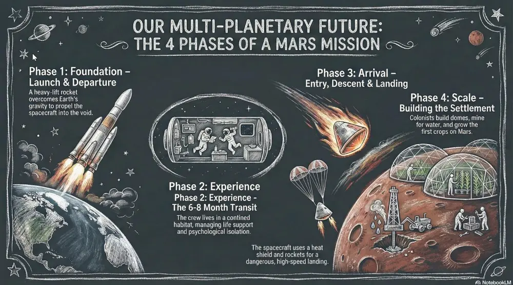
White "chalk" lines on a dark slate background with textured shading. Best for academic lectures, physics/math proofs, and historical retrospectives.
投稿者 Mark Carver — Visual Style Guide for NotebookLM Presentations
A realistic chalkboard style illustration with dusty, hand-drawn white chalk lines. Include authentic textured shading, faint chalk dust smudges, and a dark slate-gray background with a matte, slightly weathered texture. Lighting should mimic a soft classroom ambient glow.
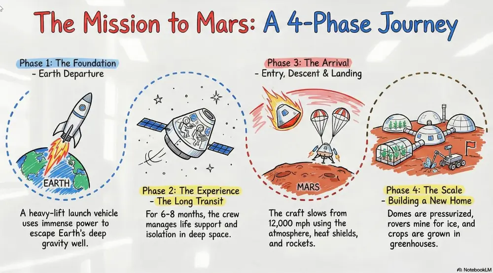
A clean look resembling markers on a glossy whiteboard. Best for internal team briefings, "live" brainstorming sessions, and agile project updates.
投稿者 Mark Carver — Visual Style Guide for NotebookLM Presentations
A clean, glossy whiteboard aesthetic featuring hand-drawn marker lines with slight 'ink-pooling' at the ends of strokes. Use basic primary marker colors (red, blue, black) on a bright white reflective background. Include faint ghosting marks from previously 'erased' content to give it a lived-in, brainstorming feel.
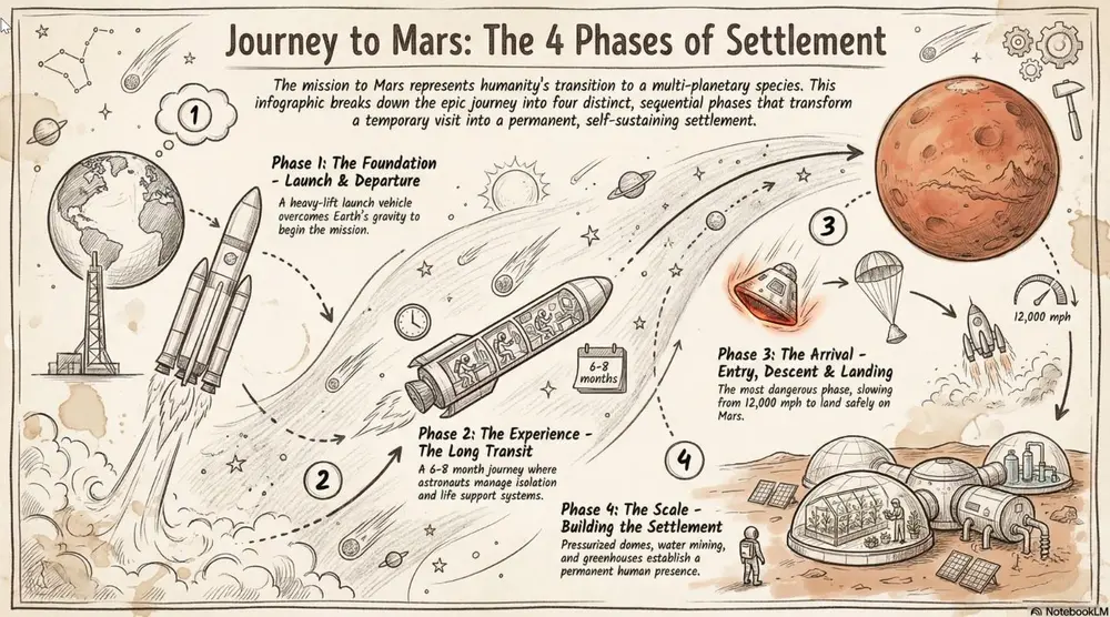
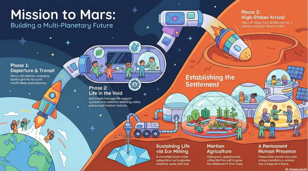
Hand-drawn icons and connectors with a classic "visual note-taking" feel. Best for executive summaries, workshop synthesis, and human-centric storytelling.
投稿者 Mark Carver — Visual Style Guide for NotebookLM Presentations
A professional sketch-noting aesthetic on an off-white, slightly textured paper background. Feature minimalist hand-drawn icons with variable-width ink lines, organic arrow connectors, and accent highlight colors in a soft marker-pen style. The composition should feel balanced and human-centric, like a live workshop synthesis.
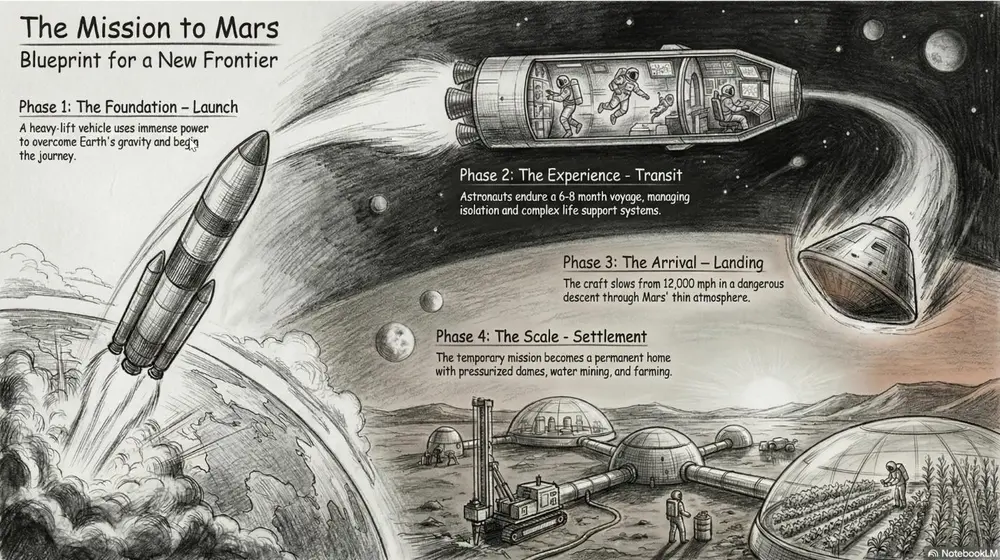
A fine-art style using monochromatic hand-drawn textures, cross- hatching, and realistic smudging. Best for high-stakes ethical discussions, historical reflections, or "Day in the Life" human-centric storytelling.
投稿者 Mark Carver — Visual Style Guide for NotebookLM Presentations
A detailed graphite and charcoal drawing with realistic hand-drawn textures. Feature heavy cross-hatching, soft pencil smudging for shadows, and visible paper grain. The aesthetic is monochromatic and sophisticated, utilizing high-contrast lighting to create a somber, cinematic, and deeply human feel.
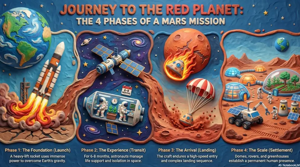
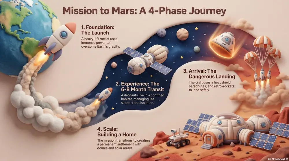
A textured, stop-motion look that appears sculpted from clay. Best for friendly explainer videos, creative workshops, internal team-building announcements, and student-facing content.
投稿者 Mark Carver — Visual Style Guide for NotebookLM Presentations
A high-fidelity claymation style featuring handcrafted 3D models with visible tactile textures. Include soft studio lighting with deep shadows, a narrow depth-of-field, and a playful stop-motion aesthetic. The scene should appear as if sculpted from physical polymer clay on a miniature set." Section 2: Technical, Engineering & Architectural Styles Best for product design, structural planning, and high-tech corporate environments.
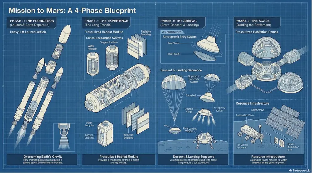
A technical style showing components separated to reveal internal assembly. Best for product mechanics, hardware engineering, and systems architecture.
投稿者 Mark Carver — Visual Style Guide for NotebookLM Presentations
A technical exploded view diagram in a clean blueprint style. Feature separated mechanical components with thin, precise dashed connecting lines. Use a high-angle orthographic projection, no perspective distortion, and a monochromatic technical palette to emphasize internal assembly and hardware engineering.
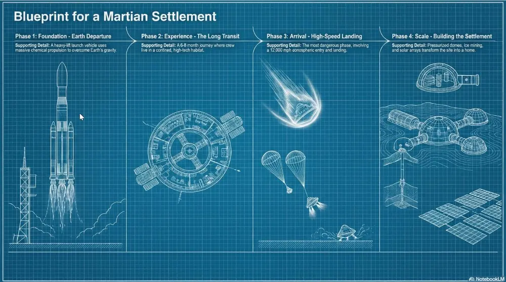
High-contrast white technical lines on a deep cyan-blue grid. Best for architectural plans, foundational strategy, and "Master Plan" slides.
投稿者 Mark Carver — Visual Style Guide for NotebookLM Presentations
A high-contrast blueprint aesthetic featuring white technical architectural lines on a deep cyan-blue background. Incorporate a light drafting grid overlay, precise margin annotations, and a 'blueprint paper' texture with slight tonal variations for an authentic master-plan feel.
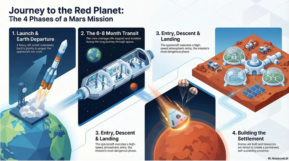
A clean 3D perspective with flat colors and sharp edges. Best for visualizing data centers, logistics networks, and SaaS ecosystems.
投稿者 Mark Carver — Visual Style Guide for NotebookLM Presentations
A clean isometric 3D illustration with flat vector colors and razor-sharp edges. Use a minimalist corporate tech aesthetic with soft directional lighting, no heavy gradients, and an 100% orthographic 45-degree camera angle to visualize logistics and digital ecosystems.
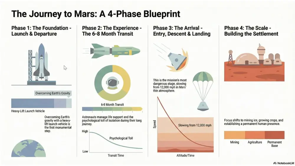
A hyper-clean, flat vector style focusing on geometric clarity and mathematical precision rather than illustration. Best for quantitative reporting, market share breakdowns, and "by-the-numbers" executive summaries.
投稿者 Mark Carver — Visual Style Guide for NotebookLM Presentations
A minimalist 2D data-visualization style featuring flat vector bars, donut charts, and line graphs. Use a clean white background, perfectly aligned geometric shapes, and a sophisticated muted palette. Emphasize clarity and whitespace with zero gradients, no shadows, and professional sans-serif labeling.
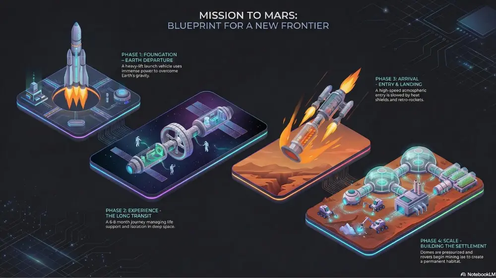
A high-tech 3D perspective set against a deep charcoal or navy background, using glowing "edge-lighting" to define shapes. Best for software architecture diagrams, cloud infrastructure pitches, and cybersecurity workflows.
投稿者 Mark Carver — Visual Style Guide for NotebookLM Presentations
A premium dark-mode isometric 3D illustration on a deep charcoal background. Features sleek, floating technological modules with vibrant neon edge-lighting and subtle glass reflections. Use a 45-degree orthographic projection, soft glowing data-streams connecting components, and a sense of infinite digital space.
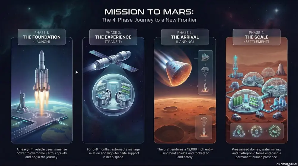
Sleek glass-morphism and minimalist high-tech UI elements. Best for aI and digital transformation pitches, software launches, and high-end corporate decks.
投稿者 Mark Carver — Visual Style Guide for NotebookLM Presentations
A high-end professional futuristic design featuring sleek glass-morphism and minimalist high-tech UI elements. Include subtle light-leaks, frosted transparency, and a clean corporate dark-mode aesthetic with refined san-serif typography and high-stakes visual weight.
A modern UI style using soft shadows to create a "plastic" extruded 3D effect. Best for mobile app concepts, dashboard designs, and minimalist tech interfaces.
投稿者 Mark Carver — Visual Style Guide for NotebookLM Presentations
A modern neumorphic UI style featuring soft internal and external shadows to create a 'plastic' extruded 3D effect. Use a low-contrast, monochromatic palette with subtle highlights on the upper-left edges to emphasize the tactile, touchable nature of the interface.
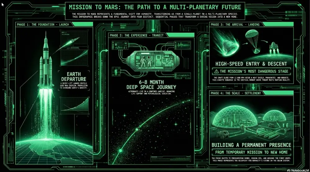
A data-heavy aesthetic using fixed-width fonts and "terminal-style" neon accents on black backgrounds. Best for cybersecurity, technical deep-dives, and financial "stress tests.".
投稿者 Mark Carver — Visual Style Guide for NotebookLM Presentations
A high-contrast technical monospace aesthetic with a deep black background. Feature vertical data streams, monospace typography, and sharp rectilinear borders in high-visibility accents to convey cybersecurity-grade raw precision and financial stress-test authority." Section 3: Narrative & Strategic Journey Styles Best for roadmaps, policy briefs, company history, and high-level visionary presentations.
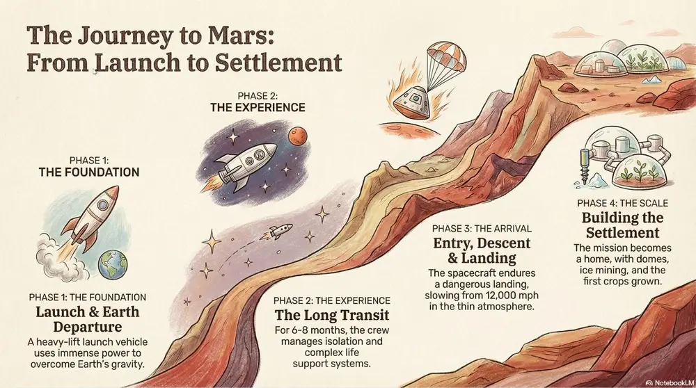
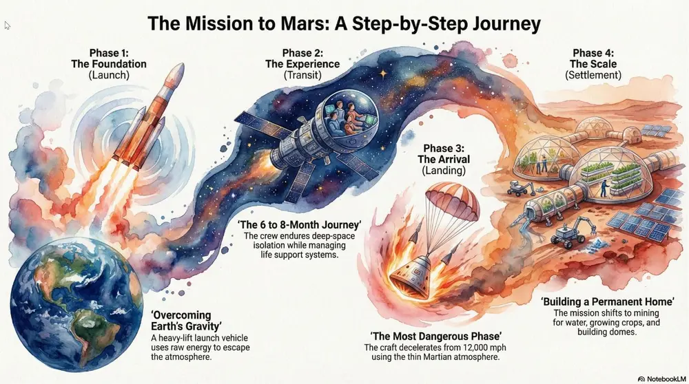
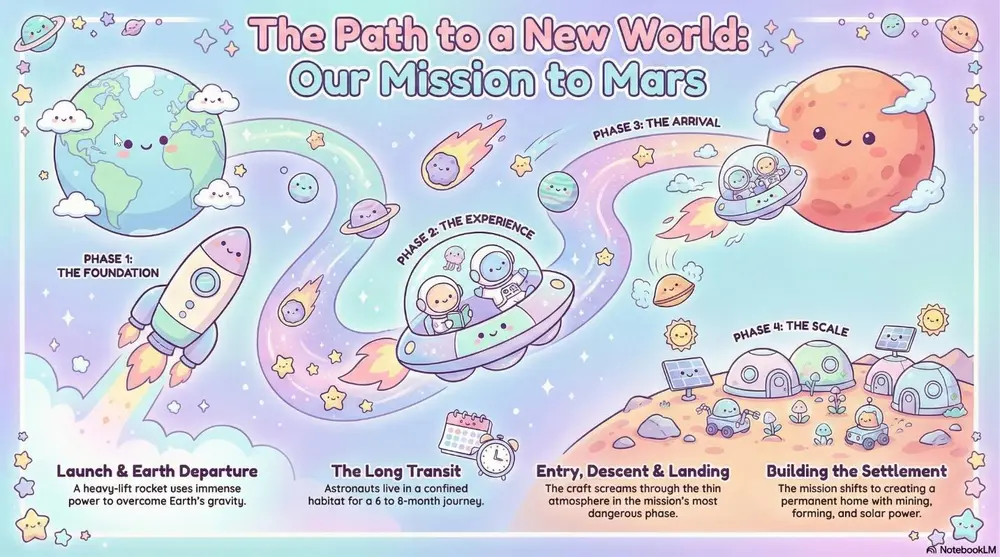
A metaphorical landscape (like a mountain path) used to show progression. Best for strategic roadmaps, project milestones, and the "Four Stages of Impact.".
投稿者 Mark Carver — Visual Style Guide for NotebookLM Presentations
A high-level conceptual journey map featuring a winding, multi-stage path through a metaphorical landscape. Use soft, painterly textures and hand-sketched milestone icons. The composition should follow a clear left-to-right narrative flow with atmospheric perspective to show distance and progress.
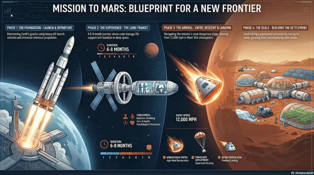
A professional, data-centric layout focused on a "Problem-Solution- Impact" narrative. It utilizes clean vector iconography, prominent "Hero Statistics" to establish high-stakes economic or technical value, and side-by-side comparison tables to validate a specific mandate or policy. Best for policy mandates, business cases, economic impact summaries, and environmental/sustainability transitions.
投稿者 Mark Carver — Visual Style Guide for NotebookLM Presentations
A professional Strategic Infographic style with a clean, vector-based layout. Use a logical narrative flow featuring high-impact numerical callouts for 'Hero Statistics,' bold headers for problem/solution framing, and technical comparison tables. The aesthetic should be modern and authoritative, utilizing a limited professional color palette and flat-design iconography.
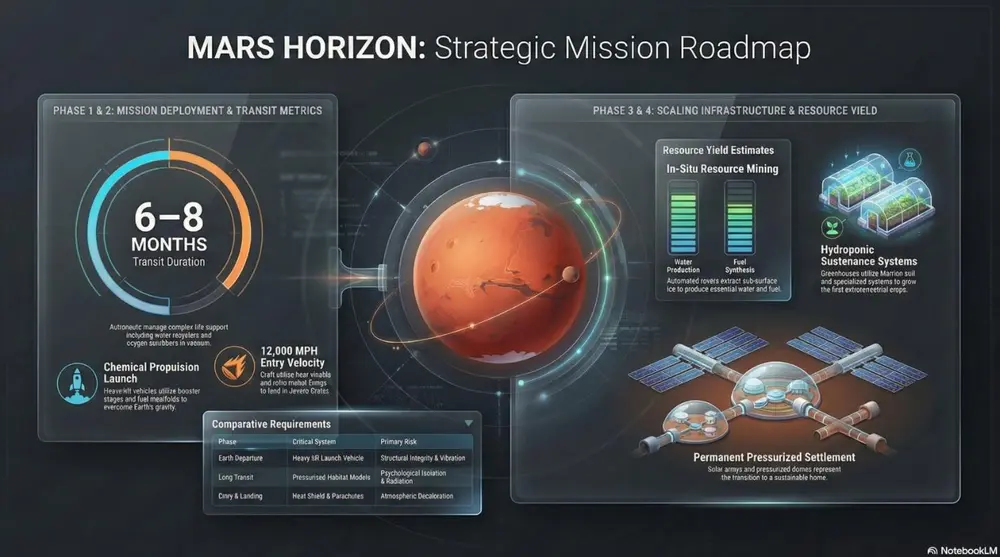
A high-density visual summary resembling a real-time command center. It uses "widgets," circular progress rings, and financial data clusters (such as CapEx, EBITDA, and IRR) to provide an at-a-glance overview of complex systems, project health, or national economic multipliers. Best for quarterly business reviews (QBRs), financial projections, project health tracking, and KPI reporting.
投稿者 Mark Carver — Visual Style Guide for NotebookLM Presentations
A sleek Executive Dashboard aesthetic featuring a dark-mode UI. Include various data visualization 'widgets' such as circular progress rings, segmented bar charts, and financial data clusters showing CapEx and ROI. Use vibrant accent colors for data points against a refined, dark-gray background with subtle glass-morphism effects.
A soft, artistic aesthetic with fluid brushstrokes and atmospheric textures. Best for environmental initiatives, visionary concepts, and emotional storytelling.
投稿者 Mark Carver — Visual Style Guide for NotebookLM Presentations
A soft watercolor painting with fluid brushstrokes, painterly textures, and minimalist bleed effects. Include a high-quality cold-press paper texture and atmospheric layering to create an artistic, emotional storytelling feel for visionary concepts.
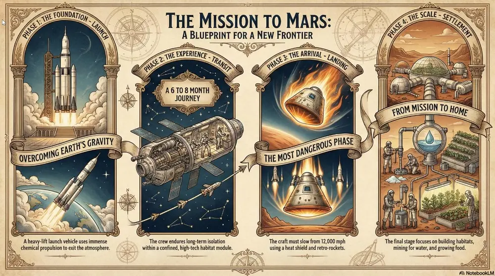
A classic, formal style with serif typography and traditional ornaments. Best for legal presentations, historical archives, and formal institutional reports.
投稿者 Mark Carver — Visual Style Guide for NotebookLM Presentations
A dignified heritage aesthetic featuring formal serif typography, traditional gold-leaf ornaments, and a historical parchment-style presentation. Use a classic, institutional layout with engraved-style illustrations to convey trust, legal authority, and legacy.
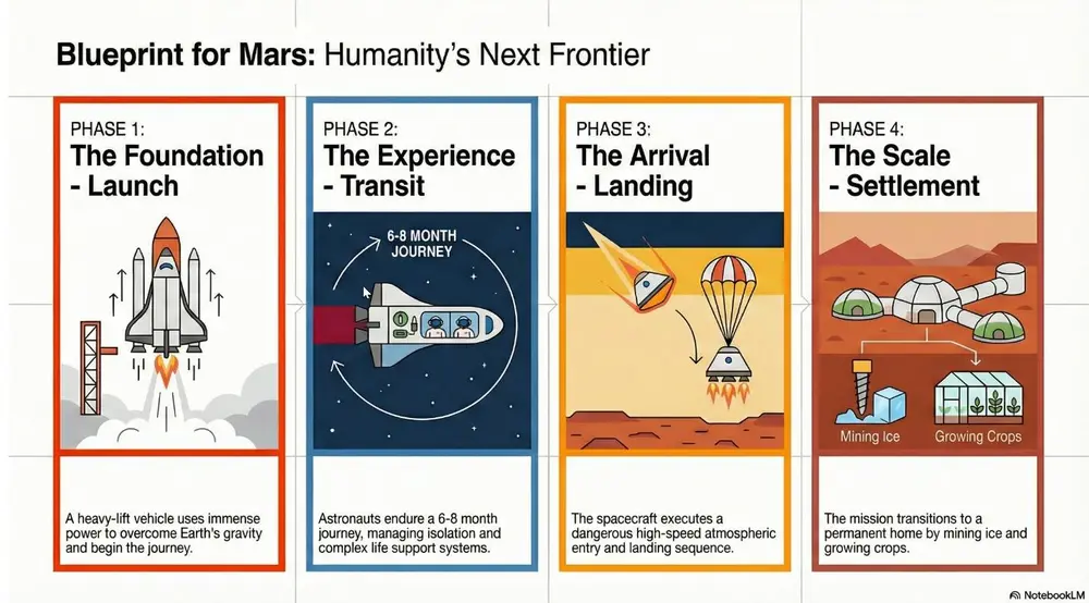
Focus on strict grids, sans-serif typography, and bold geometric shapes. Best for high-end design portfolios, clear data infographics, and minimalist communication.
投稿者 Mark Carver — Visual Style Guide for NotebookLM Presentations
A master-level Swiss Design aesthetic following a strict mathematical grid. Feature bold geometric shapes, high-contrast primary colors against a neutral light-gray background, and ultra-clean sans-serif typography. The layout must emphasize objective clarity, asymmetrical balance, and extreme whitespace.
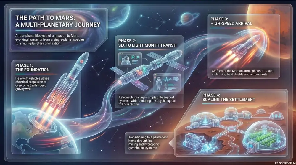
Focuses on frosted glass transparency and multi-layered depth with a vibrant glowing background. Best for fintech platforms, premium SaaS launches, and high-level visionary growth.
投稿者 Mark Carver — Visual Style Guide for NotebookLM Presentations
A premium glass-morphic UI style with multi-layered frosted glass panels and a soft ambient glow. Use crisp white typography and thin, vibrant neon accent lines for a sophisticated fintech or high-level visionary tech feel.
Flat vector illustrations with stylized human figures and a bright, non- natural primary color palette. Best for hR initiatives, DEI reports, and approachable startup pitches.
投稿者 Mark Carver — Visual Style Guide for NotebookLM Presentations
A modern corporate Memphis aesthetic featuring flat vector characters with non-natural skin tones and geometric shapes. The scene should be minimalist and cheerful, emphasizing community, accessibility, and human-centric collaboration." Section 4: Playful & Tactile Styles Best for creative pitches, youth-oriented content, and making complex data feel approachable.
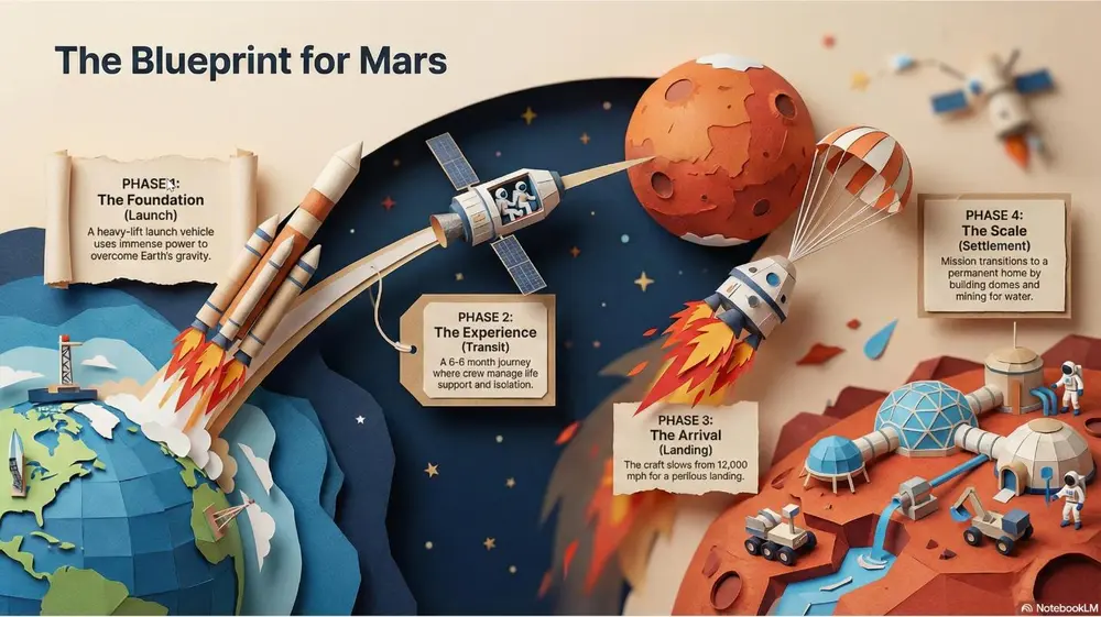
Layered, textured, and folded paper cutouts with deep shadows. Best for creative pitches, artisanal branding, and making digital slides feel "tangible.".
投稿者 Mark Carver — Visual Style Guide for NotebookLM Presentations
A detailed papercraft scene with visible paper grain and depth-of-field blur. Feature layered paper cutouts with realistic drop-shadows to show depth and sharp, folded-paper edges for a tangible, artisanal branding feel.
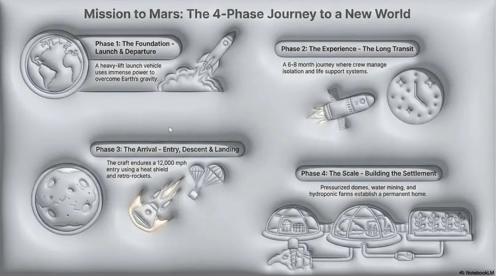
Inflated, soft, skeuomorphic shapes that look touchable. Best for modern consumer tech, kid-friendly presentations, and "softening" data.
投稿者 Mark Carver — Visual Style Guide for NotebookLM Presentations
A tactile 3D style featuring soft, inflated, skeuomorphic shapes with realistic 'soft-touch' textures. Use gentle studio lighting and balloon-like volume to make data feel approachable and non-threatening for consumer-tech pitches.
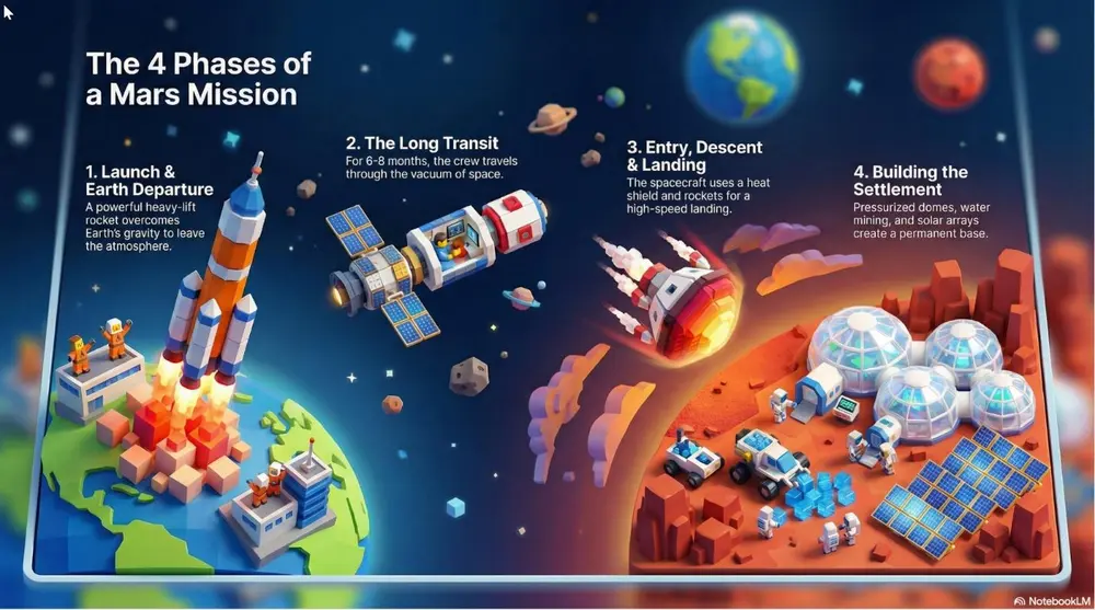
A tilt-shift view featuring blocky, toy-like characters and high saturation. Best for "Big picture" overview of facilities, smart cities, or logistical hubs.
投稿者 Mark Carver — Visual Style Guide for NotebookLM Presentations
A tilt-shift miniature world view featuring blocky, toy-like 3D characters and high-saturation colors. Use a narrow focal plane to create the illusion of a small-scale logistical hub or smart-city model.
A cute, charming aesthetic with pastel colors and rounded characters. Best for friendly customer service guides, lighthearted culture decks, and "Icebreaker" slides.
投稿者 Mark Carver — Visual Style Guide for NotebookLM Presentations
A soft Kawaii aesthetic featuring cute pastel colors and rounded characters with simple, friendly vector faces. The vibe should be charming and non- threatening, perfect for culture decks and lighthearted customer guides." Section 5: Nostalgic, Pop-Culture & Artistic Styles Best for high-impact marketing, themed presentations, and "breaking the mold.
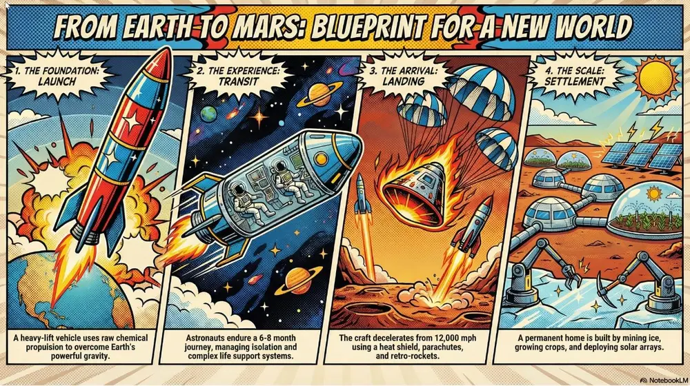
Vibrant primary colors, thick outlines, and halftone dots (Lichtenstein style). Best for marketing campaigns, "disruptive" strategy pitches, and high-energy social slides.
投稿者 Mark Carver — Visual Style Guide for NotebookLM Presentations
A vibrant pop-art style illustration featuring thick black comic-book outlines and high-contrast primary colors. Incorporate visible Lichtenstein-style halftone dot patterns and high-energy disruptive layouts for high-impact marketing.
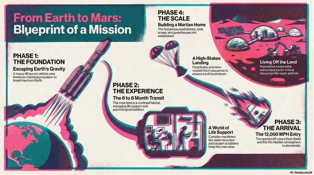
A vibrant, retro-modern aesthetic characterized by tactile grain, overlapping ink "misregistration," and high-saturation spot colors. Best for creative agency pitches, trend forecasting, and making internal culture decks feel contemporary and artistic.
投稿者 Mark Carver — Visual Style Guide for NotebookLM Presentations
A professional Risograph print aesthetic with heavy tactile grain and a distinct lo-fi texture. Feature vibrant overlapping spot colors (like fluo-pink and deep teal) creating secondary colors where they meet. Include subtle ink misregistration, soft paper tooth texture, and a high-contrast, stylized composition.
16-bit color palettes and early 3D polygon graphics. Best for tech history, gamification strategies, and developer-focused decks.
投稿者 Mark Carver — Visual Style Guide for NotebookLM Presentations
A retro-90s gaming aesthetic featuring low-poly 3D models and pixelated textures. Include 16-bit color dithering, a slight CRT monitor curve, and vibrant, saturated lighting. The UI elements should resemble 'Golden Era' RPG menus with chunky borders and pixel-art icons.
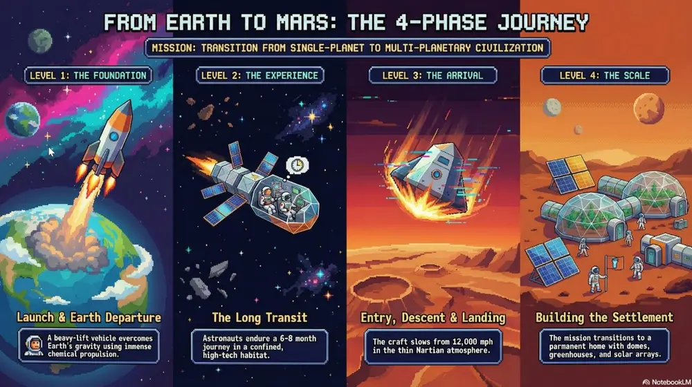
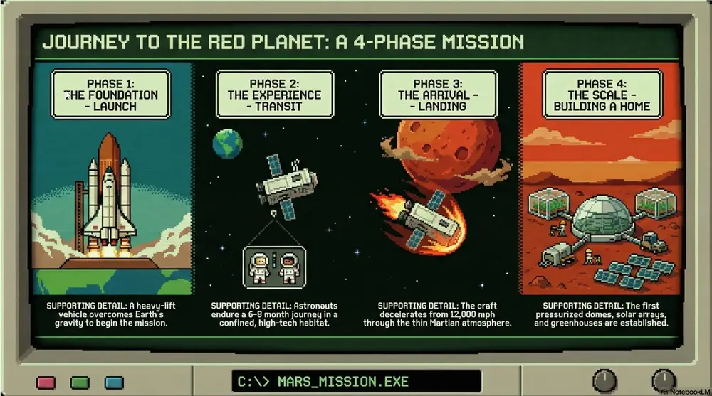
A pixelated, 8-bit digital look featuring blocky sprites, primitive digital textures, and high-contrast visuals reminiscent of early educational software. Best for survival metaphors, retro-themed journeys, and classic tech nostalgia, and illustrating “pioneer” or high-stakes project phases.
投稿者 Mark Carver — Visual Style Guide for NotebookLM Presentations
A pixelated 8-bit Oregon Trail aesthetic featuring blocky character sprites and primitive environmental textures. Use a limited CGA or EGA color palette (heavy on greens, blacks, and browns) with a subtle retro computer monitor glow and visible scanlines. The composition should follow a simple side- scrolling perspective with a vintage command-line interface feel.
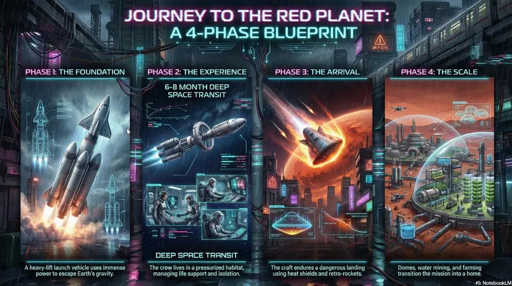
A high-contrast aesthetic featuring neon lighting (primarily pink and cyan) with gritty urban textures and high-tech UI elements. Best for future-tech forecasting, cybersecurity, and illustrating "edgy" industrial design or digital transformation.
投稿者 Mark Carver — Visual Style Guide for NotebookLM Presentations
A high-contrast Cyberpunk aesthetic featuring vibrant neon pink and cyan lighting against a dark, rain-slicked urban environment. Incorporate gritty industrial textures and holographic UI elements like tech blueprints or data overlays. The image should have deep shadows and a cinematic, atmospheric glow.
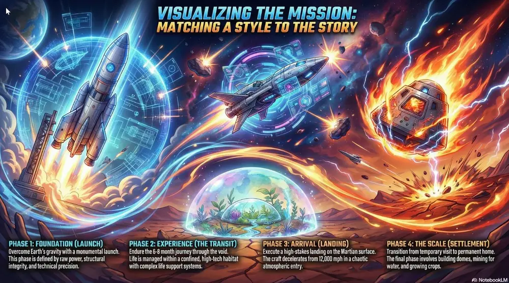
High-energy visuals with dynamic motion lines and dramatic lighting. Best for high-stakes competition decks, motivational speeches, and high-energy product launches.
投稿者 Mark Carver — Visual Style Guide for NotebookLM Presentations
A high-energy anime battle aesthetic featuring vibrant colors, dynamic motion lines, and dramatic rim-lighting. Include 'shonen' style visual effects like energy bursts and chaotic atmospheric particles to convey high-stakes competition.
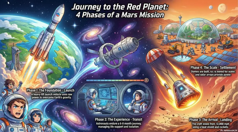
Colorful modern Japanese animation style with clean digital line work. Best for character-driven narratives and vibrant lifestyle marketing.
投稿者 Mark Carver — Visual Style Guide for NotebookLM Presentations
A modern, high-production anime aesthetic featuring expressive character designs and clean digital cel-shading. Include dynamic 'sun-flare' lighting, highly detailed backgrounds with cinematic 'lens-blur' effects, and a bright, saturated color palette typical of a feature-film production.
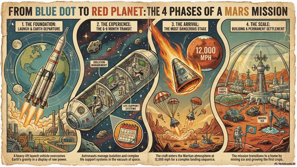
Aged paper texture with halftone dots and misaligned ink. Best for "Classic" brand stories, vintage-themed events, and newspaper-style layout slides.
投稿者 Mark Carver — Visual Style Guide for NotebookLM Presentations
A retro print aesthetic featuring aged parchment textures, slightly misaligned ink colors, and visible halftone dot patterns. Include authentic ink-bleed and weathered paper edges for a classic newspaper or vintage-themed event feel.
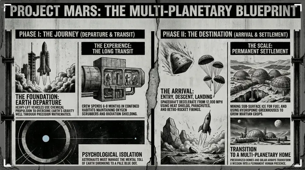
Raw, unpolished industrial textures with high-contrast, overlapping elements. Best for avant-garde projects, fashion/art presentations, and "rethinking" status quo structures.
投稿者 Mark Carver — Visual Style Guide for NotebookLM Presentations
A raw brutalist design aesthetic with unpolished concrete textures and high-contrast black and white imagery. Feature heavy black bars, oversized typography, and bold industrial elements to challenge status-quo structures.