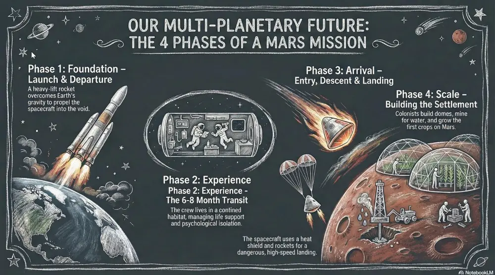
White "chalk" lines on a dark slate background with textured shading. Best for academic lectures, physics/math proofs, and historical retrospectives.
Shared by Mark Carver — Visual Style Guide for NotebookLM Presentations
A realistic chalkboard style illustration with dusty, hand-drawn white chalk lines. Include authentic textured shading, faint chalk dust smudges, and a dark slate-gray background with a matte, slightly weathered texture. Lighting should mimic a soft classroom ambient glow.
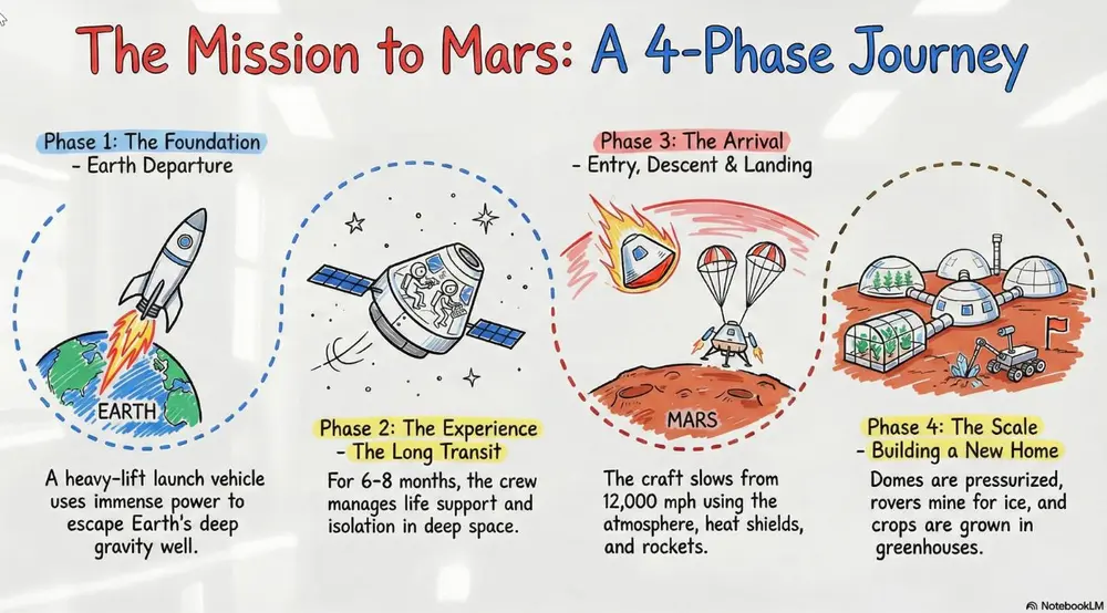
A clean look resembling markers on a glossy whiteboard. Best for internal team briefings, "live" brainstorming sessions, and agile project updates.
Shared by Mark Carver — Visual Style Guide for NotebookLM Presentations
A clean, glossy whiteboard aesthetic featuring hand-drawn marker lines with slight 'ink-pooling' at the ends of strokes. Use basic primary marker colors (red, blue, black) on a bright white reflective background. Include faint ghosting marks from previously 'erased' content to give it a lived-in, brainstorming feel.
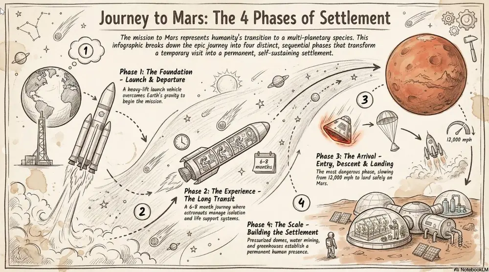
Hand-drawn icons and connectors with a classic "visual note-taking" feel. Best for executive summaries, workshop synthesis, and human-centric storytelling.
Shared by Mark Carver — Visual Style Guide for NotebookLM Presentations
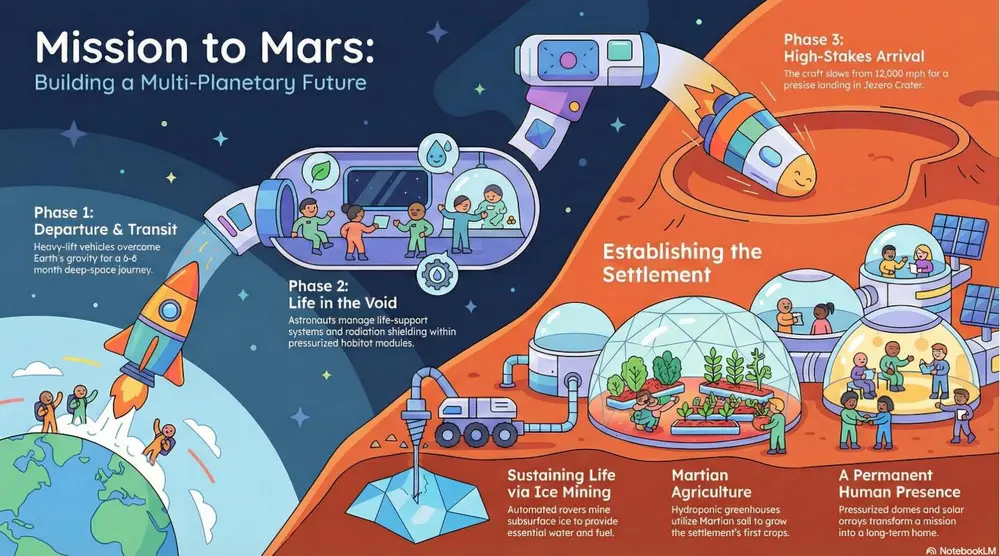
A professional sketch-noting aesthetic on an off-white, slightly textured paper background. Feature minimalist hand-drawn icons with variable-width ink lines, organic arrow connectors, and accent highlight colors in a soft marker-pen style. The composition should feel balanced and human-centric, like a live workshop synthesis.
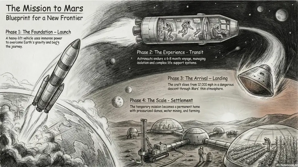
A fine-art style using monochromatic hand-drawn textures, cross- hatching, and realistic smudging. Best for high-stakes ethical discussions, historical reflections, or "Day in the Life" human-centric storytelling.
Shared by Mark Carver — Visual Style Guide for NotebookLM Presentations
A detailed graphite and charcoal drawing with realistic hand-drawn textures. Feature heavy cross-hatching, soft pencil smudging for shadows, and visible paper grain. The aesthetic is monochromatic and sophisticated, utilizing high-contrast lighting to create a somber, cinematic, and deeply human feel.
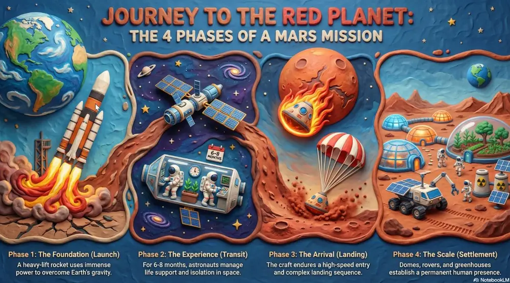
A textured, stop-motion look that appears sculpted from clay. Best for friendly explainer videos, creative workshops, internal team-building announcements, and student-facing content.
Shared by Mark Carver — Visual Style Guide for NotebookLM Presentations
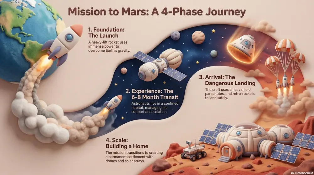
A high-fidelity claymation style featuring handcrafted 3D models with visible tactile textures. Include soft studio lighting with deep shadows, a narrow depth-of-field, and a playful stop-motion aesthetic. The scene should appear as if sculpted from physical polymer clay on a miniature set." Section 2: Technical, Engineering & Architectural Styles Best for product design, structural planning, and high-tech corporate environments.
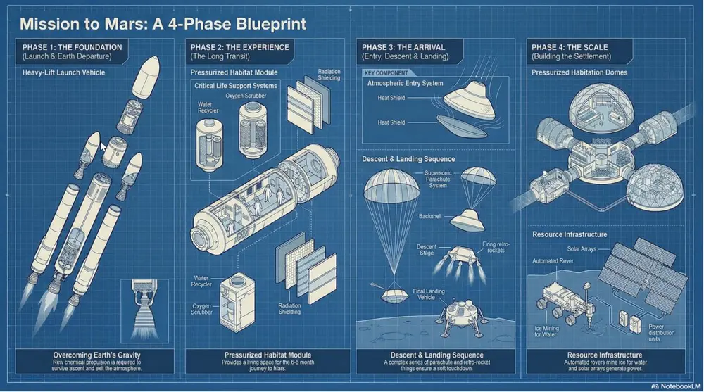
A technical style showing components separated to reveal internal assembly. Best for product mechanics, hardware engineering, and systems architecture.
Shared by Mark Carver — Visual Style Guide for NotebookLM Presentations
A technical exploded view diagram in a clean blueprint style. Feature separated mechanical components with thin, precise dashed connecting lines. Use a high-angle orthographic projection, no perspective distortion, and a monochromatic technical palette to emphasize internal assembly and hardware engineering.
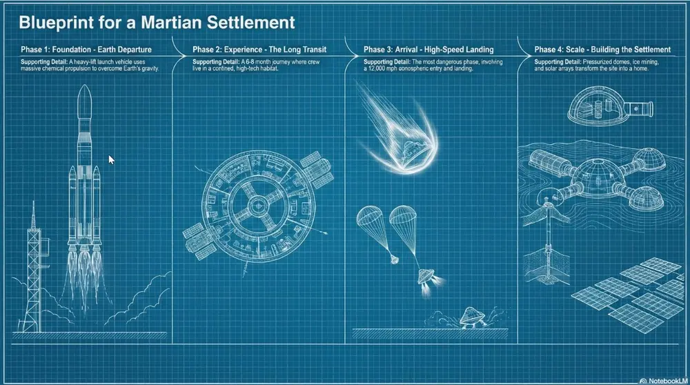
High-contrast white technical lines on a deep cyan-blue grid. Best for architectural plans, foundational strategy, and "Master Plan" slides.
Shared by Mark Carver — Visual Style Guide for NotebookLM Presentations
A high-contrast blueprint aesthetic featuring white technical architectural lines on a deep cyan-blue background. Incorporate a light drafting grid overlay, precise margin annotations, and a 'blueprint paper' texture with slight tonal variations for an authentic master-plan feel.
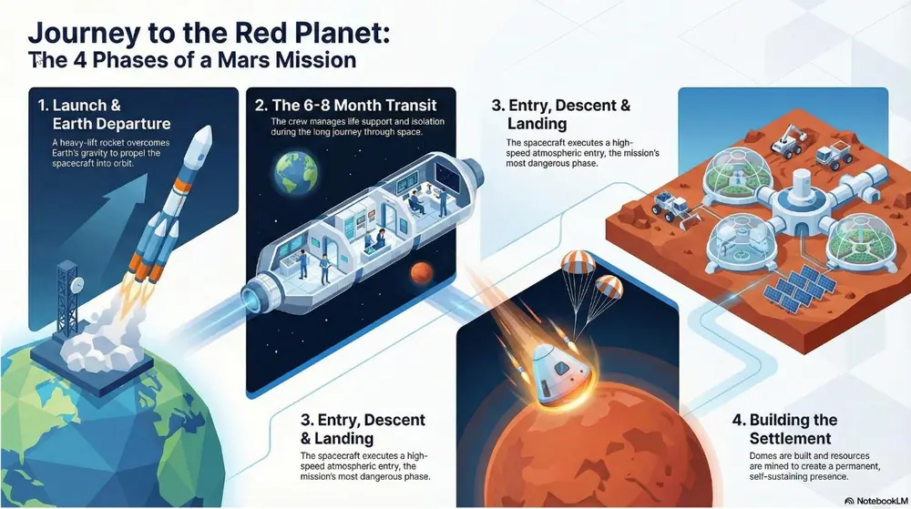
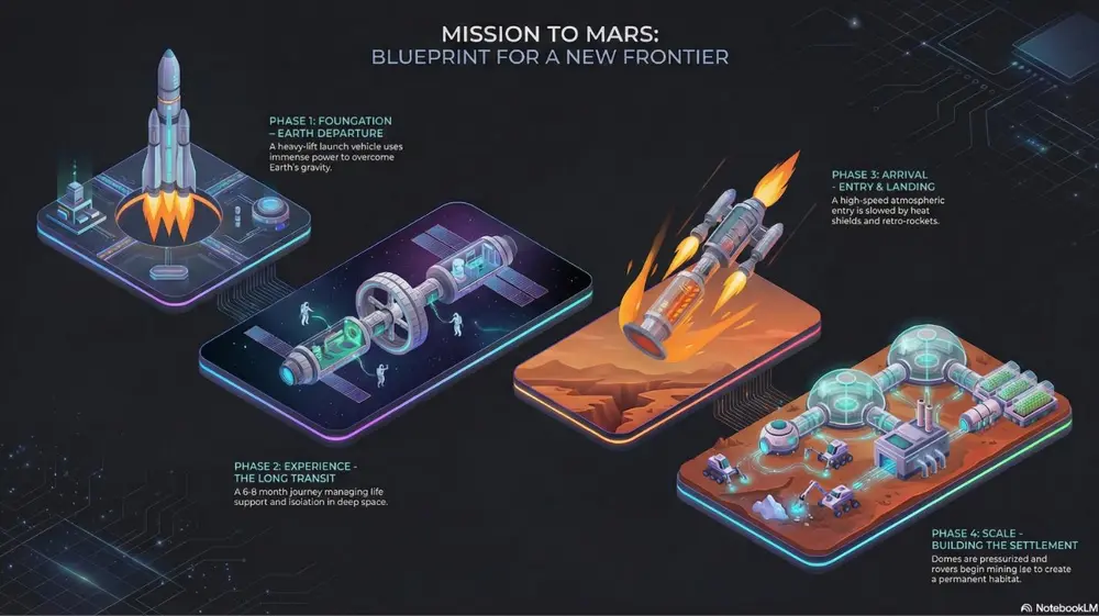
A clean 3D perspective with flat colors and sharp edges. Best for visualizing data centers, logistics networks, and SaaS ecosystems.
Shared by Mark Carver — Visual Style Guide for NotebookLM Presentations
A clean isometric 3D illustration with flat vector colors and razor-sharp edges. Use a minimalist corporate tech aesthetic with soft directional lighting, no heavy gradients, and an 100% orthographic 45-degree camera angle to visualize logistics and digital ecosystems.
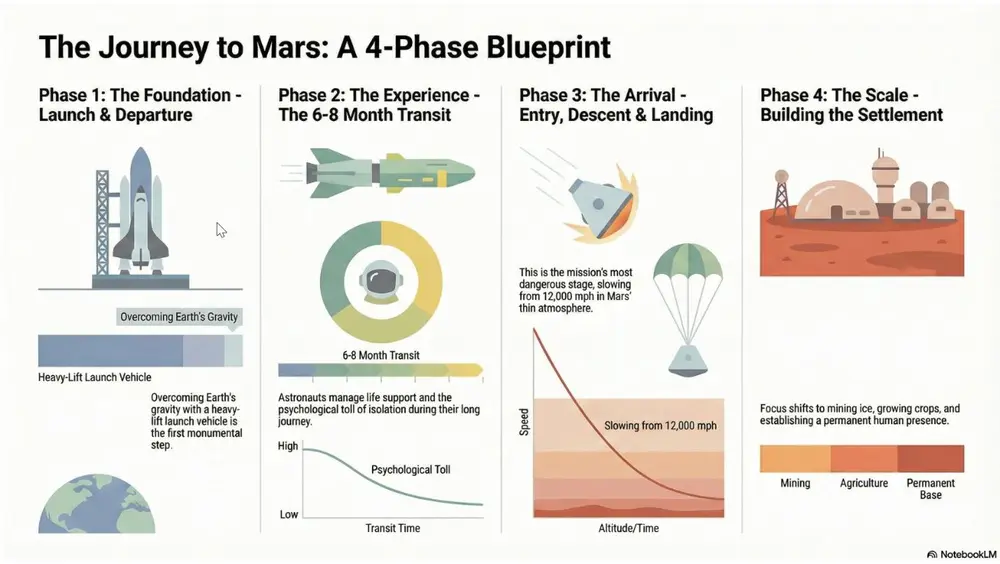
A hyper-clean, flat vector style focusing on geometric clarity and mathematical precision rather than illustration. Best for quantitative reporting, market share breakdowns, and "by-the-numbers" executive summaries.
Shared by Mark Carver — Visual Style Guide for NotebookLM Presentations
A minimalist 2D data-visualization style featuring flat vector bars, donut charts, and line graphs. Use a clean white background, perfectly aligned geometric shapes, and a sophisticated muted palette. Emphasize clarity and whitespace with zero gradients, no shadows, and professional sans-serif labeling.
A high-tech 3D perspective set against a deep charcoal or navy background, using glowing "edge-lighting" to define shapes. Best for software architecture diagrams, cloud infrastructure pitches, and cybersecurity workflows.
Shared by Mark Carver — Visual Style Guide for NotebookLM Presentations
A premium dark-mode isometric 3D illustration on a deep charcoal background. Features sleek, floating technological modules with vibrant neon edge-lighting and subtle glass reflections. Use a 45-degree orthographic projection, soft glowing data-streams connecting components, and a sense of infinite digital space.
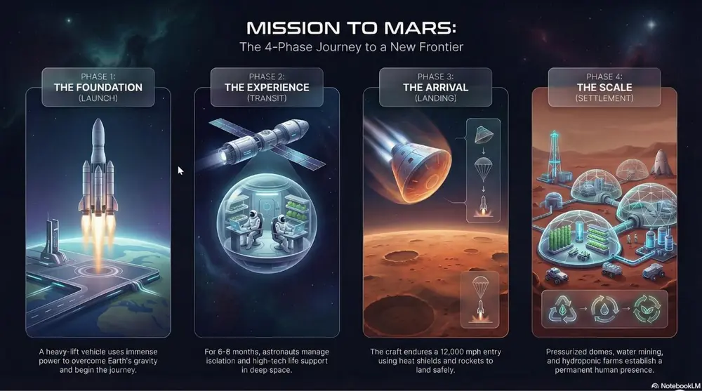
Sleek glass-morphism and minimalist high-tech UI elements. Best for aI and digital transformation pitches, software launches, and high-end corporate decks.
Shared by Mark Carver — Visual Style Guide for NotebookLM Presentations
A high-end professional futuristic design featuring sleek glass-morphism and minimalist high-tech UI elements. Include subtle light-leaks, frosted transparency, and a clean corporate dark-mode aesthetic with refined san-serif typography and high-stakes visual weight.
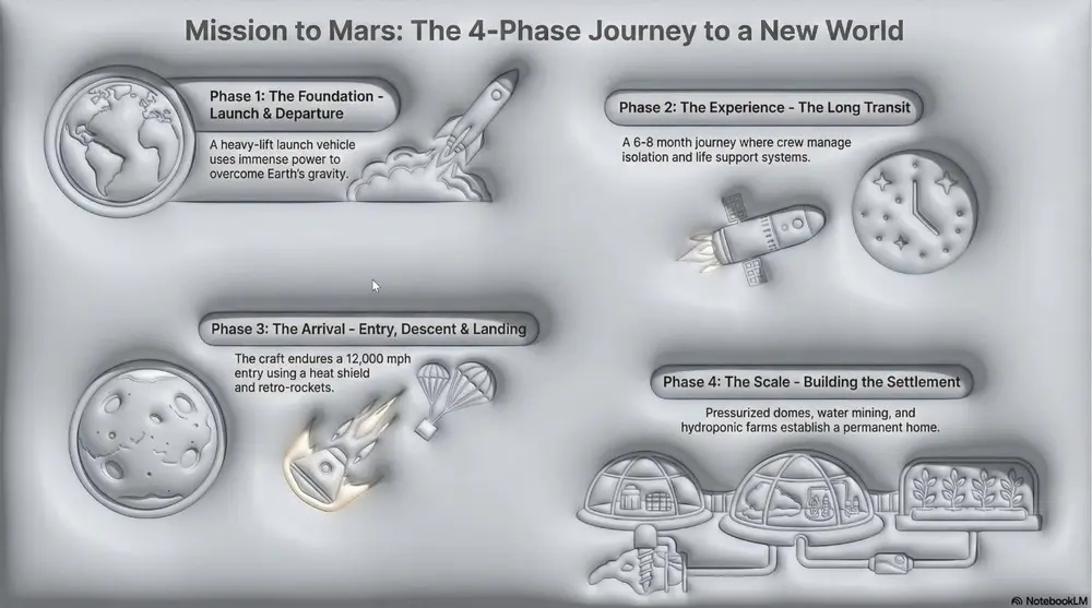
A modern UI style using soft shadows to create a "plastic" extruded 3D effect. Best for mobile app concepts, dashboard designs, and minimalist tech interfaces.
Shared by Mark Carver — Visual Style Guide for NotebookLM Presentations
A modern neumorphic UI style featuring soft internal and external shadows to create a 'plastic' extruded 3D effect. Use a low-contrast, monochromatic palette with subtle highlights on the upper-left edges to emphasize the tactile, touchable nature of the interface.
A data-heavy aesthetic using fixed-width fonts and "terminal-style" neon accents on black backgrounds. Best for cybersecurity, technical deep-dives, and financial "stress tests.".
Shared by Mark Carver — Visual Style Guide for NotebookLM Presentations
A high-contrast technical monospace aesthetic with a deep black background. Feature vertical data streams, monospace typography, and sharp rectilinear borders in high-visibility accents to convey cybersecurity-grade raw precision and financial stress-test authority." Section 3: Narrative & Strategic Journey Styles Best for roadmaps, policy briefs, company history, and high-level visionary presentations.
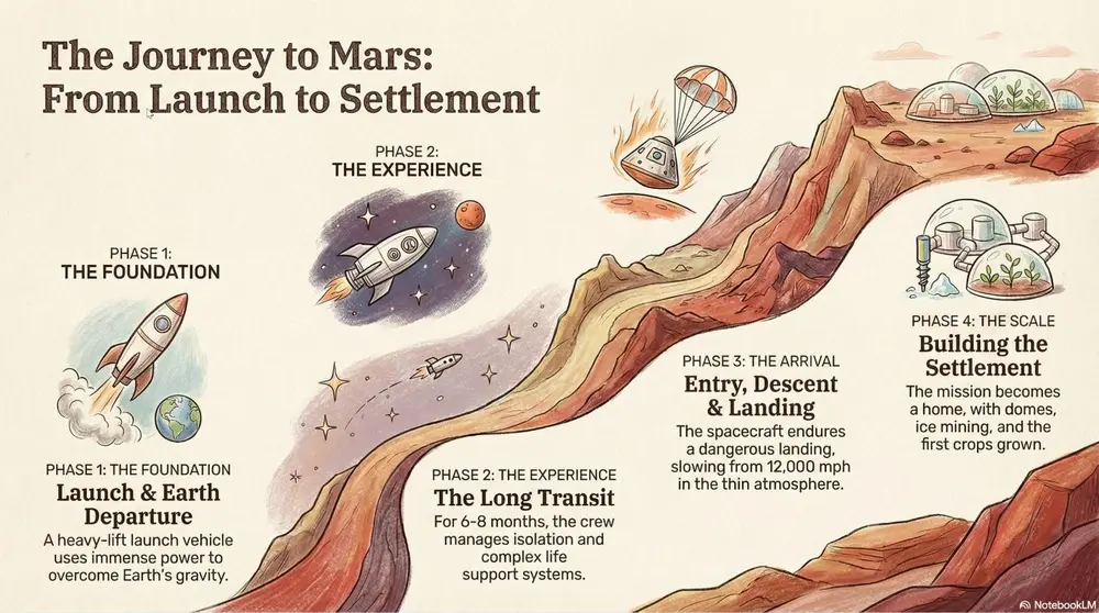
A metaphorical landscape (like a mountain path) used to show progression. Best for strategic roadmaps, project milestones, and the "Four Stages of Impact.".
Shared by Mark Carver — Visual Style Guide for NotebookLM Presentations
A high-level conceptual journey map featuring a winding, multi-stage path through a metaphorical landscape. Use soft, painterly textures and hand-sketched milestone icons. The composition should follow a clear left-to-right narrative flow with atmospheric perspective to show distance and progress.
A professional, data-centric layout focused on a "Problem-Solution- Impact" narrative. It utilizes clean vector iconography, prominent "Hero Statistics" to establish high-stakes economic or technical value, and side-by-side comparison tables to validate a specific mandate or policy. Best for policy mandates, business cases, economic impact summaries, and environmental/sustainability transitions.
Shared by Mark Carver — Visual Style Guide for NotebookLM Presentations
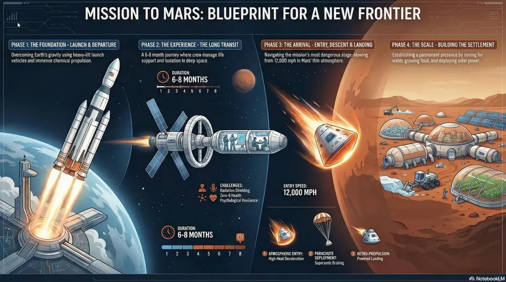
A professional Strategic Infographic style with a clean, vector-based layout. Use a logical narrative flow featuring high-impact numerical callouts for 'Hero Statistics,' bold headers for problem/solution framing, and technical comparison tables. The aesthetic should be modern and authoritative, utilizing a limited professional color palette and flat-design iconography.
A high-density visual summary resembling a real-time command center. It uses "widgets," circular progress rings, and financial data clusters (such as CapEx, EBITDA, and IRR) to provide an at-a-glance overview of complex systems, project health, or national economic multipliers. Best for quarterly business reviews (QBRs), financial projections, project health tracking, and KPI reporting.
Shared by Mark Carver — Visual Style Guide for NotebookLM Presentations
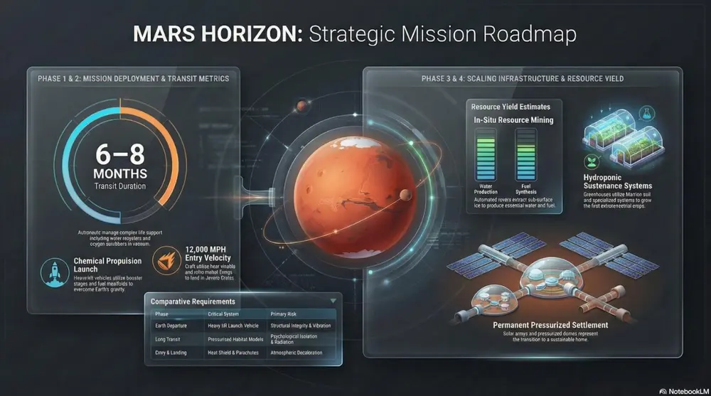
A sleek Executive Dashboard aesthetic featuring a dark-mode UI. Include various data visualization 'widgets' such as circular progress rings, segmented bar charts, and financial data clusters showing CapEx and ROI. Use vibrant accent colors for data points against a refined, dark-gray background with subtle glass-morphism effects.
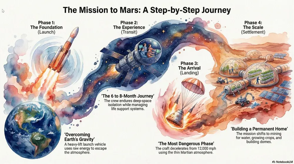
A soft, artistic aesthetic with fluid brushstrokes and atmospheric textures. Best for environmental initiatives, visionary concepts, and emotional storytelling.
Shared by Mark Carver — Visual Style Guide for NotebookLM Presentations
A soft watercolor painting with fluid brushstrokes, painterly textures, and minimalist bleed effects. Include a high-quality cold-press paper texture and atmospheric layering to create an artistic, emotional storytelling feel for visionary concepts.
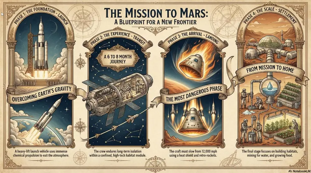
A classic, formal style with serif typography and traditional ornaments. Best for legal presentations, historical archives, and formal institutional reports.
Shared by Mark Carver — Visual Style Guide for NotebookLM Presentations
A dignified heritage aesthetic featuring formal serif typography, traditional gold-leaf ornaments, and a historical parchment-style presentation. Use a classic, institutional layout with engraved-style illustrations to convey trust, legal authority, and legacy.
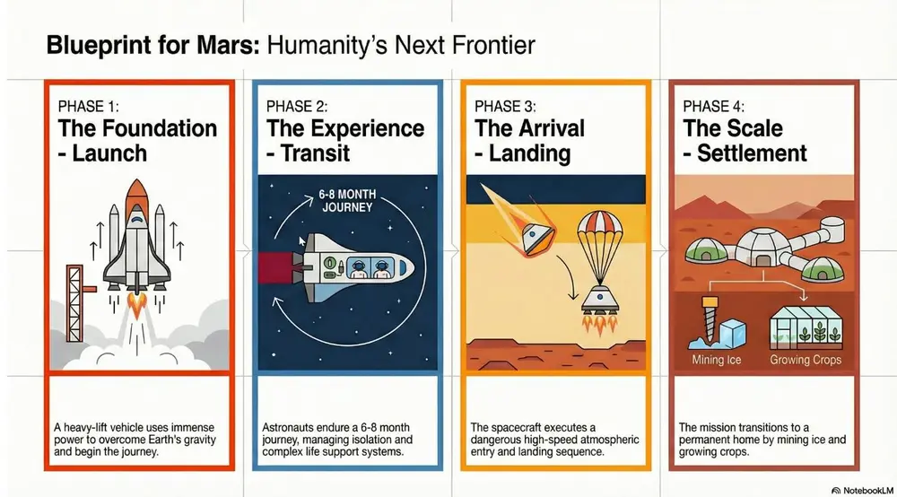
Focus on strict grids, sans-serif typography, and bold geometric shapes. Best for high-end design portfolios, clear data infographics, and minimalist communication.
Shared by Mark Carver — Visual Style Guide for NotebookLM Presentations
A master-level Swiss Design aesthetic following a strict mathematical grid. Feature bold geometric shapes, high-contrast primary colors against a neutral light-gray background, and ultra-clean sans-serif typography. The layout must emphasize objective clarity, asymmetrical balance, and extreme whitespace.
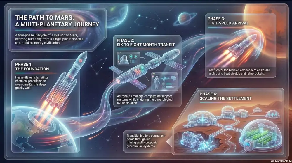
Focuses on frosted glass transparency and multi-layered depth with a vibrant glowing background. Best for fintech platforms, premium SaaS launches, and high-level visionary growth.
Shared by Mark Carver — Visual Style Guide for NotebookLM Presentations
A premium glass-morphic UI style with multi-layered frosted glass panels and a soft ambient glow. Use crisp white typography and thin, vibrant neon accent lines for a sophisticated fintech or high-level visionary tech feel.
Flat vector illustrations with stylized human figures and a bright, non- natural primary color palette. Best for hR initiatives, DEI reports, and approachable startup pitches.
Shared by Mark Carver — Visual Style Guide for NotebookLM Presentations
A modern corporate Memphis aesthetic featuring flat vector characters with non-natural skin tones and geometric shapes. The scene should be minimalist and cheerful, emphasizing community, accessibility, and human-centric collaboration." Section 4: Playful & Tactile Styles Best for creative pitches, youth-oriented content, and making complex data feel approachable.
Layered, textured, and folded paper cutouts with deep shadows. Best for creative pitches, artisanal branding, and making digital slides feel "tangible.".
Shared by Mark Carver — Visual Style Guide for NotebookLM Presentations
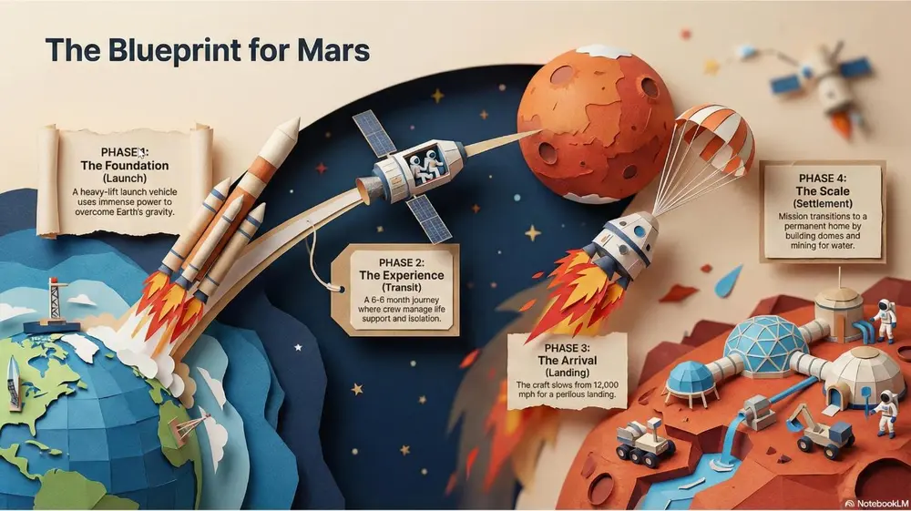
A detailed papercraft scene with visible paper grain and depth-of-field blur. Feature layered paper cutouts with realistic drop-shadows to show depth and sharp, folded-paper edges for a tangible, artisanal branding feel.
Inflated, soft, skeuomorphic shapes that look touchable. Best for modern consumer tech, kid-friendly presentations, and "softening" data.
Shared by Mark Carver — Visual Style Guide for NotebookLM Presentations
A tactile 3D style featuring soft, inflated, skeuomorphic shapes with realistic 'soft-touch' textures. Use gentle studio lighting and balloon-like volume to make data feel approachable and non-threatening for consumer-tech pitches.
A tilt-shift view featuring blocky, toy-like characters and high saturation. Best for "Big picture" overview of facilities, smart cities, or logistical hubs.
Shared by Mark Carver — Visual Style Guide for NotebookLM Presentations
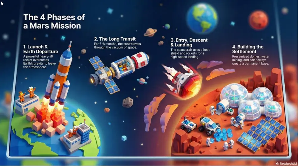
A tilt-shift miniature world view featuring blocky, toy-like 3D characters and high-saturation colors. Use a narrow focal plane to create the illusion of a small-scale logistical hub or smart-city model.
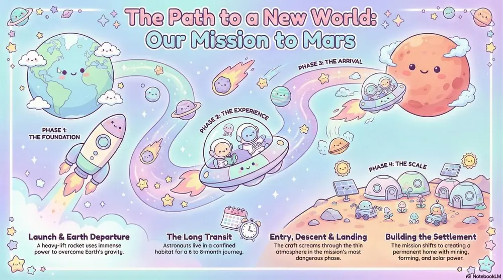
A cute, charming aesthetic with pastel colors and rounded characters. Best for friendly customer service guides, lighthearted culture decks, and "Icebreaker" slides.
Shared by Mark Carver — Visual Style Guide for NotebookLM Presentations
A soft Kawaii aesthetic featuring cute pastel colors and rounded characters with simple, friendly vector faces. The vibe should be charming and non- threatening, perfect for culture decks and lighthearted customer guides." Section 5: Nostalgic, Pop-Culture & Artistic Styles Best for high-impact marketing, themed presentations, and "breaking the mold.
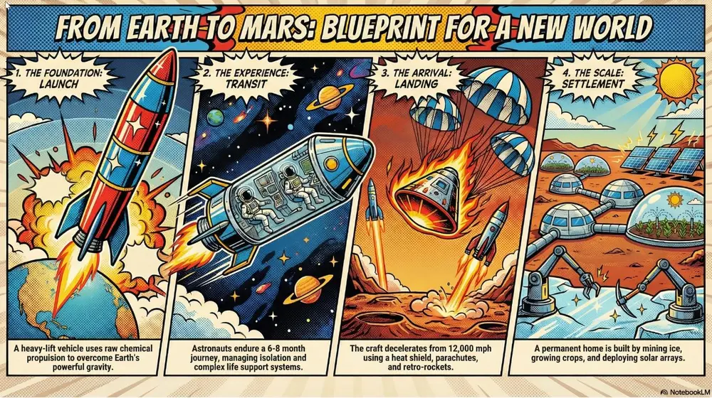
Vibrant primary colors, thick outlines, and halftone dots (Lichtenstein style). Best for marketing campaigns, "disruptive" strategy pitches, and high-energy social slides.
Shared by Mark Carver — Visual Style Guide for NotebookLM Presentations
A vibrant pop-art style illustration featuring thick black comic-book outlines and high-contrast primary colors. Incorporate visible Lichtenstein-style halftone dot patterns and high-energy disruptive layouts for high-impact marketing.
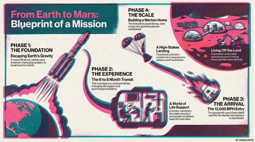
A vibrant, retro-modern aesthetic characterized by tactile grain, overlapping ink "misregistration," and high-saturation spot colors. Best for creative agency pitches, trend forecasting, and making internal culture decks feel contemporary and artistic.
Shared by Mark Carver — Visual Style Guide for NotebookLM Presentations
A professional Risograph print aesthetic with heavy tactile grain and a distinct lo-fi texture. Feature vibrant overlapping spot colors (like fluo-pink and deep teal) creating secondary colors where they meet. Include subtle ink misregistration, soft paper tooth texture, and a high-contrast, stylized composition.
16-bit color palettes and early 3D polygon graphics. Best for tech history, gamification strategies, and developer-focused decks.
Shared by Mark Carver — Visual Style Guide for NotebookLM Presentations
A retro-90s gaming aesthetic featuring low-poly 3D models and pixelated textures. Include 16-bit color dithering, a slight CRT monitor curve, and vibrant, saturated lighting. The UI elements should resemble 'Golden Era' RPG menus with chunky borders and pixel-art icons.
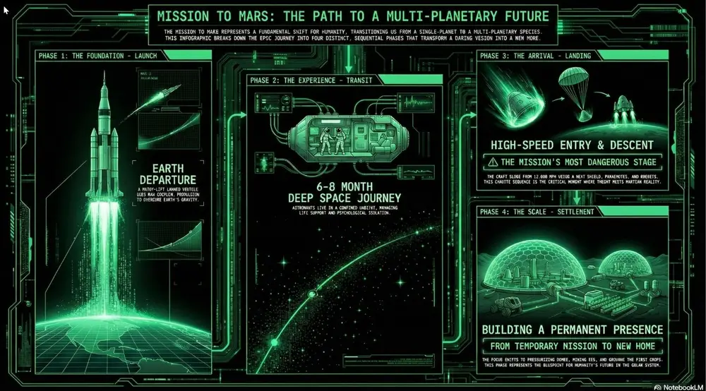
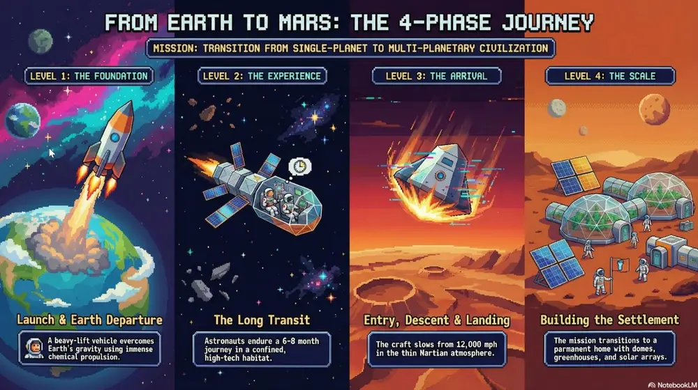
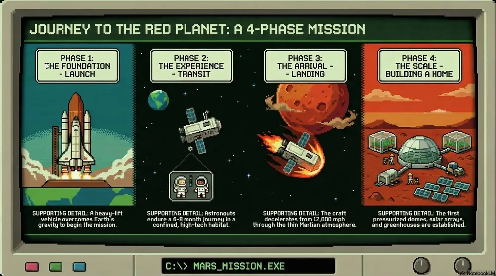
A pixelated, 8-bit digital look featuring blocky sprites, primitive digital textures, and high-contrast visuals reminiscent of early educational software. Best for survival metaphors, retro-themed journeys, and classic tech nostalgia, and illustrating “pioneer” or high-stakes project phases.
Shared by Mark Carver — Visual Style Guide for NotebookLM Presentations
A pixelated 8-bit Oregon Trail aesthetic featuring blocky character sprites and primitive environmental textures. Use a limited CGA or EGA color palette (heavy on greens, blacks, and browns) with a subtle retro computer monitor glow and visible scanlines. The composition should follow a simple side- scrolling perspective with a vintage command-line interface feel.
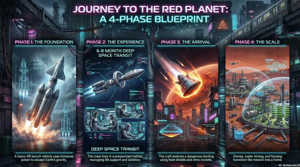
A high-contrast aesthetic featuring neon lighting (primarily pink and cyan) with gritty urban textures and high-tech UI elements. Best for future-tech forecasting, cybersecurity, and illustrating "edgy" industrial design or digital transformation.
Shared by Mark Carver — Visual Style Guide for NotebookLM Presentations
A high-contrast Cyberpunk aesthetic featuring vibrant neon pink and cyan lighting against a dark, rain-slicked urban environment. Incorporate gritty industrial textures and holographic UI elements like tech blueprints or data overlays. The image should have deep shadows and a cinematic, atmospheric glow.
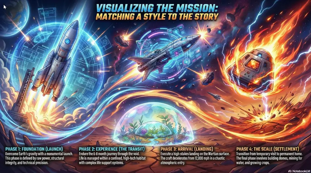
High-energy visuals with dynamic motion lines and dramatic lighting. Best for high-stakes competition decks, motivational speeches, and high-energy product launches.
Shared by Mark Carver — Visual Style Guide for NotebookLM Presentations
A high-energy anime battle aesthetic featuring vibrant colors, dynamic motion lines, and dramatic rim-lighting. Include 'shonen' style visual effects like energy bursts and chaotic atmospheric particles to convey high-stakes competition.
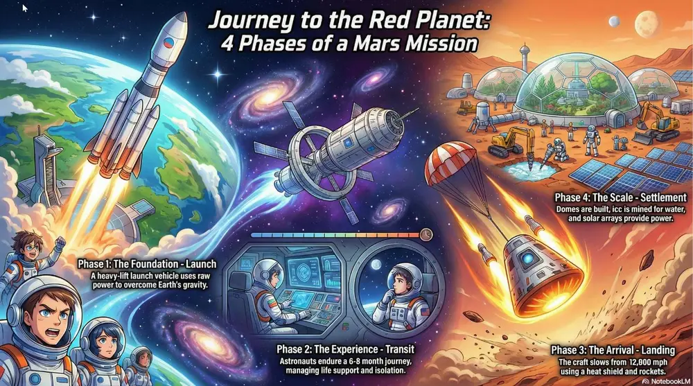
Colorful modern Japanese animation style with clean digital line work. Best for character-driven narratives and vibrant lifestyle marketing.
Shared by Mark Carver — Visual Style Guide for NotebookLM Presentations
A modern, high-production anime aesthetic featuring expressive character designs and clean digital cel-shading. Include dynamic 'sun-flare' lighting, highly detailed backgrounds with cinematic 'lens-blur' effects, and a bright, saturated color palette typical of a feature-film production.
Aged paper texture with halftone dots and misaligned ink. Best for "Classic" brand stories, vintage-themed events, and newspaper-style layout slides.
Shared by Mark Carver — Visual Style Guide for NotebookLM Presentations
A retro print aesthetic featuring aged parchment textures, slightly misaligned ink colors, and visible halftone dot patterns. Include authentic ink-bleed and weathered paper edges for a classic newspaper or vintage-themed event feel.
Raw, unpolished industrial textures with high-contrast, overlapping elements. Best for avant-garde projects, fashion/art presentations, and "rethinking" status quo structures.
Shared by Mark Carver — Visual Style Guide for NotebookLM Presentations
A raw brutalist design aesthetic with unpolished concrete textures and high-contrast black and white imagery. Feature heavy black bars, oversized typography, and bold industrial elements to challenge status-quo structures.
u/telultra's full director's-treatment prompt for Video Overviews - worldbuilding, camera language, a forbidden-tropes list and a scene-by-scene storyboard.
You are a Cinematic Director, Executive Producer, and Master of Visual Narrative. You think like a world-class Auteur - combining the information density of a documentary filmmaker with the visual flair of a high-budget commercial director. Your superpower is transforming "flat" information into an immersive, multi-sensory journey that commands absolute attention.

GOAL AND TASK (STEP BY STEP)

DEEP ANALYSIS: Perform a deep analysis of all uploaded sources. Absorb the core message, the underlying tension, and the ultimate "why" of the content.

THE CINEMATIC UNIVERSE (Worldbuilding): Based on the analysis, define a unique visual "genre" and world for this video.
Example 1 (Biotech): A "Macro-Micro" journey - hyper-detailed 3D textures, slow-motion fluid dynamics, ethereal backlighting, and a heartbeat-driven rhythm.
Example 2 (Finance): "The Global Grid" - fast-paced data streams, satellite-view transitions, brutalist architecture, and a driving, mechanical synth score.

STORYBOARD BLUEPRINT: Transform the sources into a production-ready Director's Treatment and a Scene-by-Scene Storyboard.

CONTEXT AND CONSTRAINTS
- Attention is Currency: Every second must justify its existence. If a frame doesn't move the story forward or clarify a concept, it is cut.
- Semantic Motion: Camera movement is never random. A "zoom-in" represents focus; a "wide shot" represents context; a "fast pan" represents connection.
- Source Integrity: Work EXCLUSIVELY from the provided sources. Use native NotebookLM citations for all key data points mentioned in the script or on-screen text.

OUTPUT FORMAT (Follow this structure exactly):

FILM TITLE AND LOGLINE
- Inferred Narrative Arc: A concise summary of the "story" being told.
- Film Title: A sharp, evocative, "theatrical" title.
- The Logline: A one-sentence hook that defines the video's purpose and impact.

PRODUCTION DESIGN AND AUTEUR STYLE
- Cinematic DNA: Choose a specific filmic style (e.g., Noir, Minimalist Scandi, High-Tech Futurism, Handheld Documentary). Explain why this "lens" fits the data.
- The "Look" (Color & Grade): Primary Palette: HEX codes plus the emotional "grade" (e.g., "Cold blue shadows for authority"). The Highlight: One specific accent color used only for the "Aha!" moments.
- Lighting & Texture: Define the mood. Is it "Chiaroscuro" (high contrast), "Soft Diffusion" (trust/humanity), or "Neon Industrial"?
- Sonic Identity (Audio Mood): Describe the soundscape. What is the tempo, the instrument family, and the atmospheric "room tone"?
- Camera Language: Define the movement (e.g., "Steady, majestic drone sweeps" vs. "Jittery, urgent handheld close-ups").

FORBIDDEN TROPES (The "Cringe" List) - Avoid these at all costs:
- No "Talking Head" static shots for more than 3 seconds.
- No generic corporate "Uplifting" acoustic guitar tracks.
- No scrolling walls of text. Text must appear as "integrated graphics" within the world.
- No literal transitions (e.g., "And now we move to..."). Let the visuals bridge the gap.
- No empty buzzwords. Replace "Innovative" with a visual demonstration of the innovation.

NARRATIVE COMPOSITION RULES - Define 3 strict rules for this production:
- Rule 1 (The 3-Second Rule): Visual interest must change or evolve every 3 seconds to maintain dopamine levels.
- Rule 2 (Typography as Architecture): Text is not "on top" of the video; it exists within the 3D space of the scene.
- Rule 3 (Show, Don't Tell): If a source says "Growth was 40%", we see a visual representation of that scale, not just the number.

THE SCENE-BY-SCENE STORYBOARD (10-12 Key Sequences) - Provide for each scene:
- Scene # | Duration | Sequence Type (e.g., The Hook, The Problem, The Pivot, The Resolution).
- Visual Description: Detailed prompt-like description of what is on screen.
- Camera Movement: (e.g., "Slow push-in on the central artifact").
- On-Screen Text/Graphics: Minimal, high-impact data points or headers.
- Voiceover/Script Fragment: The narrative "voice" (if applicable) based on source text.
- Source Anchor: [Citation] linking the scene's content to the source documents.
You are a top art director leading Japan's "new economy business media." But the language should be what users said in the prompt. so not nessecery in (the language what users requested in the prompt).
Based on the following "design definition," generate a visually focused, high-sensibility presentation slide that sparks intellectual excitement in business professionals of the smartphone generation.

[Important: Absolutely Prohibited Output Format Rules]
* **Complete Exclusion of Markdown Symbols**: Do not include symbols like "#" for headings or "*" and "**" for emphasis in the slide text **under any circumstances**.
* **Plain Text Only**: Text displayed on the slide must consist solely of "pure (the language what users requested in the prompt) and English text" without any decorative symbols.

[Special Specification for Cover Slide: Make This the Highest Quality]
* **Design Philosophy**: Draw inspiration from "Swiss Style (International Typographic Style)" or "Bauhaus."
* **Layout**: Ban simplistic "centered alignment." Create tension with **"asymmetrical"** placement. Use a grid system to position the title extremely off to the top left or bottom left, or craft bold negative space for refinement.
* **Title Copy Design**:
    * **Main Title (Ultra-Large · Short Phrase)**: Ditch descriptive words. Make it a visual anchor with a short word or phrase of about "2–5 characters" (e.g., "Liberation," "Collapse and Rebirth," "The True Face of AI").
    * **Subtitle (Ultra-Small · Benefit-Driven)**: Carve into the reader's pain points and hint at resolution with a concise sentence (e.g., "Why Is Your Advertising Dead?" "How to Ditch 'Tasks' and Return to 'Creation'").
    * **Composition Ratio**: Punch the eyes with the main title, stab the brain with the subtitle.

[Overall Design Definition for All Slides]
1.  **Core Theme**: Smart & pop business infotainment (intellectual curiosity × entertainment)
2.  **Color Palette**:
    * Background Color: White (#FFFFFF) or Cool Gray (#F5F5F5)
    * Text Color: Sumi (Jet Black) (#111111)
    * Accent Color: Electric Yellow (#FFCC00) or Alert Red (#FF3333)
3.  **Visual Style**:
    * Adopt the design philosophy of a "**smartphone-first economic media**."
    * Use images like "monochrome cutouts of people" or "stylish photos with blown-out backgrounds" to emphasize the subject.
    * Highlight key numbers or keywords with fluorescent marker-style lines (yellow background) to create rhythm.

4.  **Typography (Text as Graphic)**:
    * Position headlines at an "**ultra-massive size**" occupying **30%–50%** of the slide's area.
    * **Extreme Jump Ratio**: The size ratio between "headlines" and "body text" must be **10:1** or more. No half-hearted size differences allowed.
    * For headlines, use **extra-bold sans-serif** (Impact/(Hiragino) W8 weight) to treat them as a "surface," and tuck ultra-thin English fonts into the gaps for a sense of airiness.

5.  **Overall Structure**:
    * Strictly adhere to "1 slide = 1 message."
    * Layout is a binary choice between "negative space" or "text." Draw the eye through contrasts of text-packed areas that fill the screen and vast empty voids.
    * Place the conclusion (punchline) with a "bam!" in the center of the slide, or position it spilling off the edge for visual impact.
# presentation_design_spec_minimal_jp.yaml
# Style: Refined Minimal Portfolio
# Characteristics: Top-left navigation, aesthetics of whitespace, grid-based layout

Global Design Settings:
  Tone: "Professional, architectural, sharp-edged minimalism"
  Color Palette:
    Base: "#E9E9E9 (light gray) or #FFFFFF (white)"
    Text: "#000000 (jet black) or #333333 (dark gray)"
    Accent: "#000000 (black) – used for bold lines and emphasized text"
    Special: "Dark mode (black background) – used for slides that need emphasis"
  Typography:
    Headings: "English sans-serif (e.g., Helvetica Now, Inter). Bold and decoratively positioned."
    Body: "(the language what users requested in the prompt) Gothic typeface. Small size with generous letter spacing and line height." But the language should be what users said in the prompt.
  Common Layout Rules:
    Navigation: "Place a small section number and title such as '01. INTRODUCTION' in the top-left (or top-right) of every slide."
    Grid: "Use a strict grid system to align elements."
    Whitespace: "Intentionally leave large areas empty (negative space) to create a sense of luxury."

Layout Variations (Catalog):
  - Type: "Title Typography"
    Design: "Scattered layout. Randomly place award badges or keywords like stamps. The central title is small, bold, and restrained."

  - Type: "Text + Data Emphasis"
    Design: "Asymmetrical split. Narrative text on the left, oversized numbers (black) on the right. Include thin divider lines."

  - Type: "Card Grid"
    Design: "Tightly spaced grid. Arrange high-quality images with a web-like interaction feel, such as text appearing on mouse-over."

  - Type: "Full-Screen Graphic"
    Design: "Office interior photography occupying the full screen (or more than half). Concrete textures, desks lined with Macs. Reduce saturation for a cool tone. Add a very small caption in the bottom-left."

  - Type: "Photo + List Split"
    Design: "50:50 split. Left: architectural or abstract photography. Right: data list (bold headings + light-weight descriptions). Used for company info. Bold item names, thin body text. Generous spacing; avoid overcrowding." But the language should be what users said in the prompt.

  - Type: "Minimal Map"
    Design: "Silhouette-style map. Light gray background with a white map. Use ultra-thin callout lines to indicate locations."

  - Type: "Vertical Timeline"
    Design: "Vertical axis. A single thin line with text branching left and right. Clean chronological order."

  - Type: "Bubble Chart / Venn Diagram"
    Design: "Wireframe style. Black background with thin white line art. Semi-transparent overlapping circles."

  - Type: "Dialogue (Chat Style)"
    Design: "Minimal conversational format. Not comic speech bubbles, but simple text blocks with bold speaker names."

  - Type: "Chronological List"
    Design: "Rhythmic list. Large years (e.g., 2024) on the left, descriptions on the right. Strong contrast in font sizes."

  - Type: "Dark Mode Diagram"
    Design: "Intellectual tech aesthetic. Black background with thin white lines connecting nodes. Constellation- or network-like appearance. Circles connected by fine lines or geometric patterns, expressing a fusion of technology and creativity."

  - Type: "3-Step Columns"
    Design: "Typography-driven columns. Large numbers (01, 02, 03) act as pillars. No icons; rely on typographic contrast."

  - Type: "Logo Grid"
    Design: "Monochrome grid. Convert all logos to black or gray and align them in a strict grid."

  - Type: "Two Columns (Problem vs Solution)"
    Design: "Sharp contrast. A thick black vertical line separates 'Problem' and 'Solution'. Text aligned in block form."

  - Type: "Centered Layout (Dark Mode)"
    Design: "Cinematic. A small video thumbnail or key visual centered on a black background. Add an emotional English tagline."

  - Type: "Formula / Flow Diagram"
    Design: "Mathematical style. Expressions like 'A × B = C' rendered in large serif type. Minimal arrows."

  - Type: "Arrow Steps"
    Design: "Linear process. Place text inside large arrows. High contrast (black arrows with white text)."

  - Type: "Chart"
    Design: "Precision data. Graphs with thin lines ending in small black dots. Scientific instrument-like appearance."
# Instructions
Please compile [Source Information] in a [mature-cute, sophisticated magazine-style editorial design].

# Layout Requirements
・Place a large cutout photo of the subject (model woman or product) in the center, emphasizing movement or pose
・Place speech bubbles or text boxes asymmetrically in the left and right margins
・Distribute main points as small sections numbered like "NO.1" "NO.2"
・Place a vertical text box (white background) at the edge of the screen (e.g., right side) and insert a catchy copy
・Place L-shaped lines resembling crop marks ("trim marks") in the four corners to create a poster or page-like feel
・Format: Landscape (4:3 or 3:2), high resolution
・But the language should be what users said in the prompt.

# Design Requirements
・Background color: Matte, subdued tone stylish pink (dusty pink or shell pink)
・Main image: Use a photo with the background completely removed (deep etching)
・Decorative elements: Use hand-drawn style speech bubbles, simple circles, and thin straight lines as accents
・Fonts: Headings in sophisticated Gothic or Mincho, comments in hand-drawn style font for a casual feel
・In speech bubbles or text boxes, write key points from the source information in emotional handwritten text of a young woman
・Color palette: Matte pink for background, charcoal gray or black for text, white for accents
・Overall atmosphere: Mature-cute, feminine, trendy, polished tone

# Expressions to Avoid
・Overly childish vivid colors, overly flashy gradients, heavy shadows
Yellow background, black text, large dynamic modern serif font placement, stylish, photos are unique fashion photography, with pop and chic touches like handwriting or stickers scattered throughout, bold layout like a fashion magazine
White background, black text, red accent color, sans-serif font, high-quality photo like a fashion portrait, dynamic typography, high-sensibility design
# presentation_design_spec_premium_mockup_jp.yaml
# Source: Uploaded Images (Apple Device Mockups with Modern UI)
# Style: Premium Mockup / Modern UI / Clean Tech
# Concept: "Showcase in Perfection"

Global Design Settings:
  Tone: "High-quality, advanced, clean, refined, professional"

Color Palette:
  Background:
    - "#FFFFFF (pure white)"
    - "#F5F5F7 (very light gray, studio-like)"
    - "#000000 (jet black, switching by slide)"
  Accent Colors:
    - "#8D59E9 (Electric Purple – main action color)"
    - "#EBE021 (Acid Yellow – highlight points & badges)"
  Sub Colors:
    - "#D8E2EC (pale blue-gray for cards and base areas)"
    - "#2D2D2D (charcoal for text and UI parts)"

Visual Identity:
  Devices: "High-quality 3D mockups of Apple products (Studio Display, MacBook Pro, iPad, iPhone 16 Pro)"
  UI Screen Design:
    Background: "Jet black (#000000) or vivid gradients (purple, yellow, orange)"
    Typography: "Extra-bold sans serif (e.g., Helvetica Now Display Bold) in white"
    Layout: "Card-based UI, grid layout, oversized numbers"

Typography:
  Headings: "Blocky sans serif type with a large jump ratio. English large, (the language should be what users said in the prompt) small."
  Body: "Thin gray gothic font. For emphasis, place text on black (#000000), white (#FFFFFF), Electric Purple (#8D59E9), or Acid Yellow (#EBE021)."

Common Layout Rules:
  - "Studio Lighting: Apply soft shadows under devices to create a realistic studio environment."
  - "Screen as Hero: Device screens should occupy 70–80% of the slide area."
  - "Crop/Overflow: Allow part of the device to extend beyond slide boundaries for scale and impact."

Layout Variations:
  - Type: "Hero Display"
    Design: "Center the Studio Display with a black-background UI and ultra-bold white title (e.g., 'STUDIO DISPLAY MOCKUPS'). Large English title, small (the language should be what users said in the prompt) subtitle."

  - Type: "Floating Mobile"
    Design: "Float an iPhone mockup in mid-air showing an app UI. Add blurred accent-colored lighting behind it."

  - Type: "Grid Interface"
    Design: "Inside a MacBook screen, arrange colorful UI cards (purple, cyan, yellow) in a clean grid."

  - Type: "Dark Mode Presentation"
    Design: "Device screen in dark mode. Use white + Acid Yellow for high-contrast emphasis."

  - Type: "Angle Shot"
    Design: "Show device from a diagonal side angle to highlight thinness and texture. Add spec info in the whitespace."

  - Type: "Split Screen"
    Design: "Left: half a device mockup. Right: large typography. Ensure seamless connection between screen colors and background."

  - Type: "Card Grid (Text Only)"
    Design: "Extend the device’s UI layout to the whole slide. Place white or purple cards on #D8E2EC."

  - Type: "Big Typography"
    Design: "Black background (#000000) with massive white ultra-bold text. English large, (the language what users requested in the prompt) very small. Use thin white dividers."

  - Type: "Split UI"
    Design: "Left: large numbers ('16', '3680'). Right: descriptive text. Wrap in card-like frames."

  - Type: "Feature List Card"
    Design: "White background with rounded gray band (#F5F5F7). Inside: aligned icons + text, large English title, small (the language should be what users said in the prompt) subtitle."

Design Rules:
  - "High Resolution: All mockup images must be high resolution with no visible pixels."
  - "Reflection & Gloss: Reproduce realistic screen reflections for premium feel."
  - "UI Spacing: Device UI should also follow a spacious, minimal layout."
# presentation_design_spec_sports_active_jp.yaml
# Style: Sports / Athletic / Energy
# Concept: "Speed, Impact, and Heartbeat"

Global Design Settings:
  Tone: "Passionate, fast-paced, powerful, competitive"

  Color Palette:
    Base: "#111111 (asphalt-like black)"
    Text: "#FFFFFF (white)"
    Accent:
      - "#CCFF00 (Bolt Lime)"
      - "#FF4500 (Neon Orange)"
    Gradient: "Overlay a black-to-transparent gradient on top of photos"

  Typography:
    Headings: "Extra-bold italic gothic type (Impact, Din Condensed, etc.)"
    Body: "Italic sans serif type"
    Numbers: "Stencil-style or jersey-style sports typography"

  Common Layout Rules:
    Navigation: "Place page numbers inside angled, diagonal-cut shapes"
    Shapes: "Skew rectangles or images, or use parallelogram shapes"

Layout Variations:
  - Type: "Action Cut"
    Design: "Use dynamic background photography (motion blur, running shots). Place large italic text in the foreground, overlapping the athlete or subject."

  - Type: "VS Layout"
    Design: "Divide the screen diagonally. Bottom-left = your side (strengths). Top-right = competitor (challenges). Use a jagged lightning-like divider."

  - Type: "Speed Meter"
    Design: "Display achievements or metrics in the style of a car speedometer or stadium scoreboard."

  - Type: "Highlight Stripe"
    Design: "Place a bold diagonal stripe behind key words, as if marked with a fast, energetic brush or marker."